-
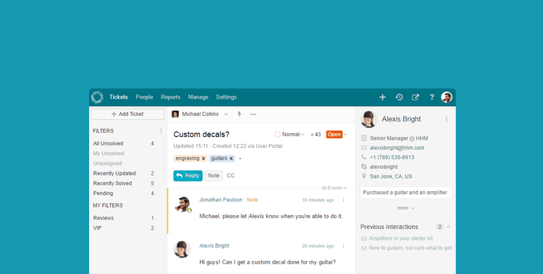
Helprace Tickets Get a New, Fresh Look
Fri, 15 Sep 2017, in Helprace, Releases

In this post we’ll talk about the (huge) design change in your Helprace ticketing interface. In making these changes, we strove for simplicity while keeping the functionality you’ve grown to love.
So while things may look a little different, we assure they will make your ticketing experience better than ever.Many of you have gotten used to the old interface, but fear not – haven’t made any drastic changes in the overall way that Helprace does its case management. Instead, we’ve reworked most of the commands for maximum efficiency, and worked extra hard so that every little bit of screen space has a purpose.
The main changes:
So what have we done? We increased the performance, introduced a more unified design language across Helprace. At the same time, we focused on making your support system as stress-free as it could possibly be!
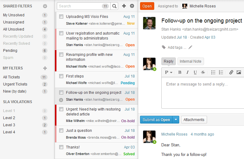
Here’s what your ticketing portal looked like before:

When coming up with the new design we took the “less is more” approach to heart. We considered every single design element and went through numerous iterations before settling on something that would work best.

The new design is all about making Helprace look natural and intuitive to use. This involved not only moving certain things around but also adding crucial commands to get things done.
These changes you’ll surely notice – but we’ll point them out, just in case :)
New ticket button
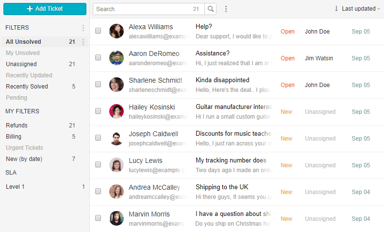
It’s a lot easier to add tickets right now (you can’t miss the big blue button in the left sidebar). It’s also there when you’re working on a ticket or browsing between filters.
Cleaner filters
The giant gear and plus icons are gone for a cleaner look. The core functionality hasn’t changed though: add, edit, delete and save searches as filters using the vertical ellipsis button (⋮).
Easier sorting
Sorting tickets becomes a breeze. Click the drop down at the top right of the screen and arrange tickets using a number of properties (there’s a lot of them!)
Bulk ticket updates
Bulk ticket actions allow you to change multiple tickets right in the ticket list. We already talked about updating tickets in bulk in our documentation. Here are some of the bulk actions you can perform:
- subject
- requester
- ticket states
- assigning tickets
- sending replies or adding notes
- applying macros or saved replies
- adding, removing or setting specific tags
Updated conversations
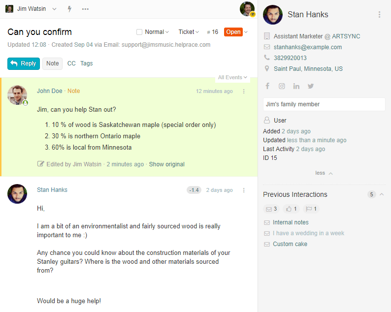
To make communication super easy, we redesigned the conversation thread, too.

Collaborate together using private notes, merge tickets together and perform every task with the full knowledge of customer data. Sounds like a lot? Here’s what else:
- no unsightly text box
There’s no unsightly text box to clutter the look of your tickets anymore. If you want to reply or add a note, simply click the right buttons (Reply or Note). This makes it easier to distinguish from you’re adding a response just updating ticket data. - delete drafts easily
If you abandon a reply or note without submitting it, you can continue where you left off. You can remove your drafts anytime by clicking the bin icon at the bottom left of the text box. - sweet user sidebar
No more guessing – know all about who your user is. Previous interactions, satisfaction ratings and app integrations are all conveniently listed in the sidebar. You can fill in personal data (company, social media profiles), pull it in automatically or even build beautiful custom apps according to your needs.
Hungry for more? This is just the first of a few blog posts we’ll roll out regarding our massive overhaul. As always, please let us know what you think! Our support portal is always open for questions, suggestions or just a quick hi. We’re always down for a chat!
Lots of hugs and kisses from all of us at Helprace :)
Tags: release
